• Giveaway sponsored by Minted.
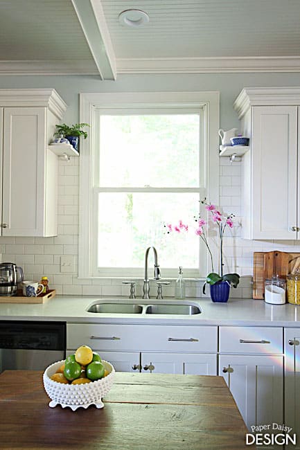
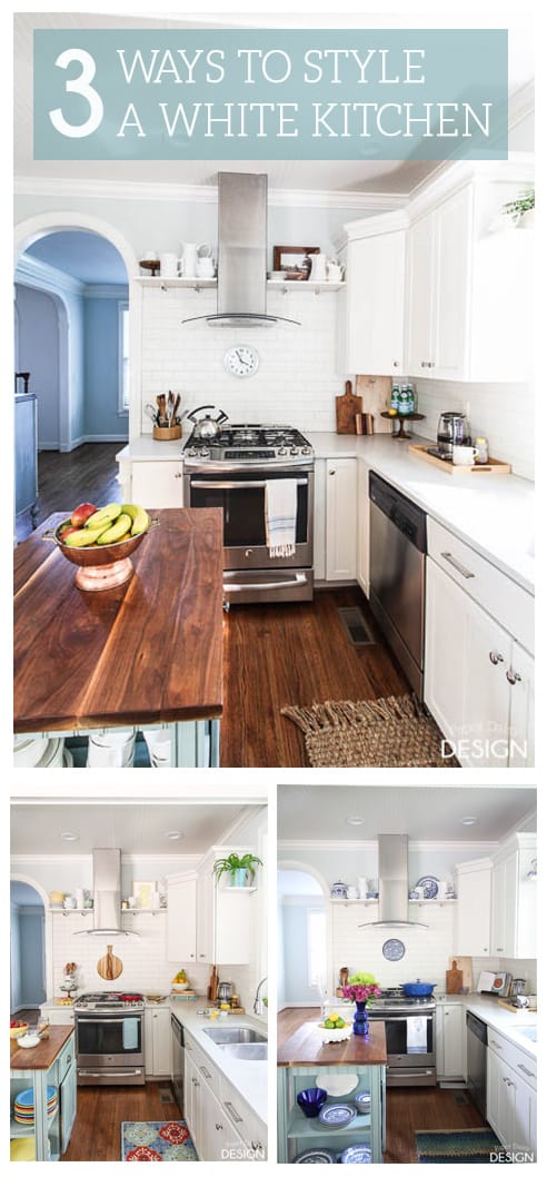
If you are a regular reader or subscriber, then you know I’ve been busy styling our remodeled white kitchen 3 different ways to demonstrate the versatility of a transitional white kitchen. Through simple design changes in art and accessories, each white kitchen has a distinct character, not at all boring white.
Today I’ve got a little recap, a peek into our everyday family kitchen, for real, and a giveaway to help you refresh your space.
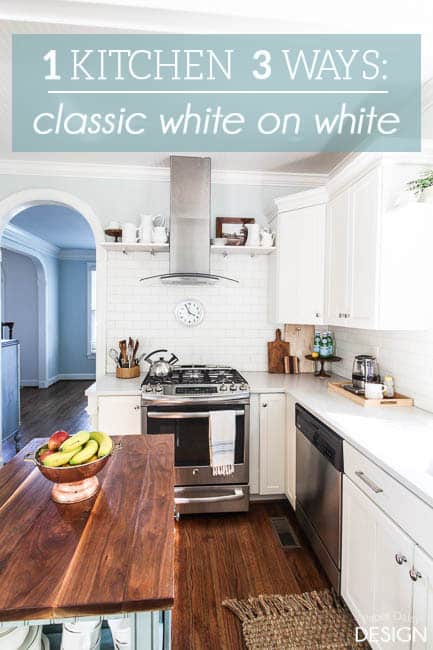
Let’s review. Starting with the The Classic White on White
With the muted wall color and soft white cabinets all that’s needed to warm up this design is the addition of wood and copper tones. The subtle contrast between the blue-grey walls and the white ironstone keep the room feeling light, fresh, soothing, even monochromatic.
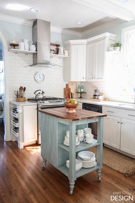
The washed turquoise island, the other constant in the kitchen, adds function, storage and injects just the right amount of color to keeps the room cozy.
Want to see more of the Classic White on White Kitchen? Click HERE. (Sources too.)
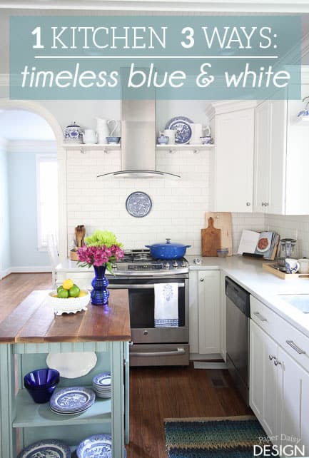
The second kitchen style features one of my favorite color combos, The Timeless Blue and White.
I must admit this version of the white kitchen almost stole my heart. I started collecting blue and white pieces over the last year. At a garage sale early this summer I was lucky and blessed to acquire a good haul of plates and saucers in my favorite pattern.
The striking cobalt blue creates a stunning contrast in this look, while not overpowering the classic details like the marble inspired quartz countertops and the clean lines of shaker cabinets. You can get some fantastic kitchen worktops from somewhere like Topsco, so check them out.
To see more views of this Timeless Blue and White Styled Kitchen HERE.
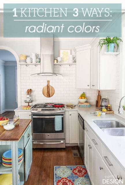
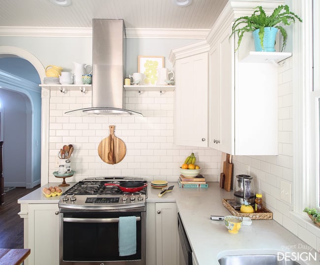
The third kitchen gets bold pops of color from it’s Fiestaware inspired color palette. I called it the Radiant Colors.
The wood accents ground the playful pops of color in this kitchen. Again, you’ll notice just a subtle shift in the pieces on the open shelves transform the look.
I hope you enjoyed this unique way of revealing our remodeled kitchen. In each post, I shared notable characteristics about the design and all the little details that transformed this once dark and drab kitchen. Be sure to see them all.
The core design of each kitchen remained the same, but the overall feel of the space varied, just like me. I find it difficult to pigeon hole myself in just one design style. When interiors are done well, whether it’s traditional, transitional, modern or bohemian, I appreciate the individual qualities that inspire me. My friend told me about the Kitchen wall tiles at atlas ceramics and how they exuded those qualities Having a flexible design is also important for me because if I feel like moving my kitchen in a certain design direction for a while I can. Having services similar to plumbing service cranford nj can give more options when it comes to moving my kitchen around to play with space I have available. If I love the look of a space, I often find myself longing to step inside. Hopefully, you’ve found one version of the kitchen that spoke to you in the same way.
So, now I’m sure you are wondering what does my kitchen look like everyday? Well, take a look.
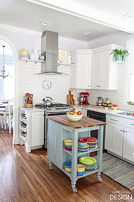
It’s not much different from the Radiant Colors Kitchen. The choice was easy, it’s bright, happy and the Fiestaware dishes are what we use everyday.
There were a few changes made to the counters. The addition of practical items like a large kitchen tool caddy and mixer add much needed function next to the stove and the main food prep areas. And there’s almost always a few clean dishes in the sink or on the counter waiting for the angels to dry them. My dear hubby is the angel that washes the evening dishes. I cook, he does the dishes. It’s a good deal.
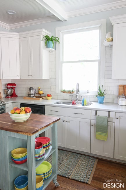
I also switched out the rug from the previous version. Actually, it’s the same rug from the Timeless Blue and White kitchen, just flipped upside down. I preferred the more subtle colors and the texture. The great thing about this compromise, is if I happen to score some cereal bowls to go with the “new” blue and white plates, I can move them to the cart and use them everyday and turn the rug right side up.
I’m a bit of a candle fanatic. I burn one for several hours after dinner each night. While I love to cook, I’m ready for the smell of dinner to go away after we’ve eaten.
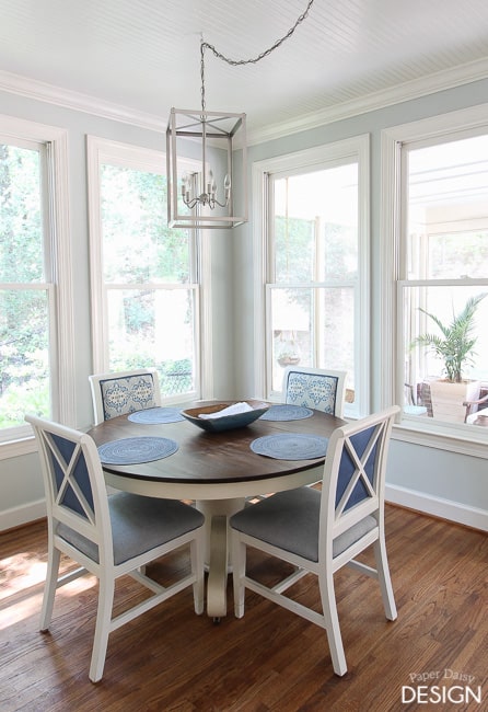
On a daily basis, I keep placemats on the table. Having them there keeps me from wiping down the table after each meal and extends the life of the finish. We also keep this dough bowl in the center for our everyday napkins.
And remember those fresh flowers from each version of the kitchen? When I do purchase my favorite supermarket bunches, I usually place them here on the peninsula we created when we removed a portion of the wall between the kitchen and the living room.
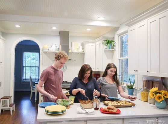
And this is us, well me and our teenagers in our kitchen. On any given night you will find us gathered at the heart of the kitchen serving dinner, buffet style.
Most of the items you see in the spaces have been collected over time, shifted and restyled. I did make a few new selections for this shelf.
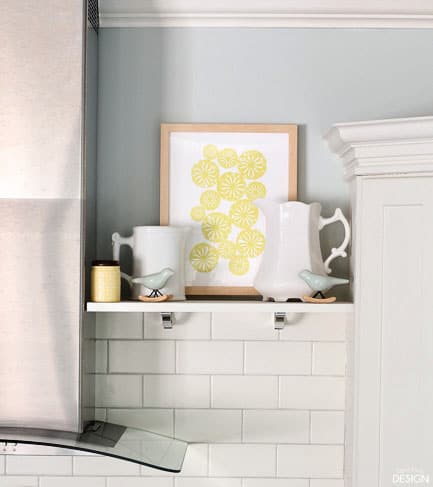
This cheerful print and frame are from Minted Art. It’s called Sliced Citrus and comes in several color options. Great for customizing your space with just the right pop of color! Minted is my favorite resource for high-quality prints and limited edition works. They are no longer just a resource for custom cards and stationery.
Giveaway is closed.
a Rafflecopter giveaway
Good luck and thank you for reading and following along. Thanks, to Minted for this giveaway and for the print I was gifted.






59 Comments
valerie sobus
August 15, 2015 at 9:23 amit’s technically not an 18×24…..but i love this image! we have a brown kitchen and i’d love to hang this above my stove/oven. 🙂
Laurie Adams
August 15, 2015 at 9:37 amI have been a fan of blue and white for a long time so the blue and white kitchen is my favorite, but they are all beautiful!!!
Danielle
August 15, 2015 at 12:08 pmLove the white on white! Its great inspiration for my new kitchen and the pining for pineapple print would be just the perfect touch
Leslie
August 27, 2015 at 7:48 amDanielle,
So glad you were inspired! Good luck with your new kitchen!
Dana
August 15, 2015 at 7:01 pmFrom Minted I would choose Heron’s Nest! Love the blue and white kitchen. My all time favorite!
Leslie
August 27, 2015 at 7:49 amI actually have the Heron’s Nest print as well and it is stunning! I loved the blue and white too!
Jennifer
August 17, 2015 at 3:21 pmOh my goodness, I’ve been eyeing the Big Country Sky print from there for forever! Great giveaway. Thanks!
Michele
August 18, 2015 at 9:53 amI really like the Sunset Study print. It is beautiful and when I look at it I just can’t help but feel calm. This would be great to put up in my apartment.
susan
August 21, 2015 at 8:23 pmshadow in a storm is beautiful!
Trish
August 21, 2015 at 10:46 pmIt’s a toss up between the radiant and the cobalt. I am just a huge fan fan of an abundance of colors and I love blue. All three are beautiful.
Ali Celestino
August 22, 2015 at 12:27 amLove the Cobalt
Julie Waldron
August 22, 2015 at 7:59 amI might choose Vintage Books.
Carla D.
August 22, 2015 at 11:13 amI would choose the Extra Frosting one. 🙂
Trish
August 22, 2015 at 2:58 pmI like the meander.
Abby Barge
August 25, 2015 at 10:38 amSo hard to choose! But it would be between the ‘Flutter Watercolor,’ the ‘Hummingbird,’ or the ‘Roof Party’ print.
Sara Filler
August 25, 2015 at 6:29 pmI really like the Ocean Currents print
wen budro
August 26, 2015 at 10:14 amI would choose the Open Door photography print.
john hutchens
August 26, 2015 at 8:37 pmI like Sail art print
Laurie Nykaza
August 26, 2015 at 8:41 pmI love this picture they are all so beautiful too Marin Cows
WALL ART PRINTS
Marija
August 27, 2015 at 7:06 amTough choice, but right now I’m leaning toward the Ombre Waves print.
Diana Hatch
August 27, 2015 at 7:33 amI love the vibrant colors
Leslie
August 27, 2015 at 7:52 amThe vibrant colors is fun isn’t it. I enjoy the brightness, I love color and I like that it’s kind of unique looking.
Kimberly
August 27, 2015 at 7:50 amI really like the foil pressed designs. I would pick one of the loved themed ones for our bedroom. The “I Love You That Is All” design is one of my favorites.
courtney hennagir
August 27, 2015 at 8:23 amSuch a tough choice! I love “dark florals no. 1”.
Lindsey L
August 27, 2015 at 8:58 amSoooo many wonderful choices! I think I’d have to go with “Flawed Beauty”. It speaks to me in a way…that even as humans our every day wear and tear, like the painting, makes us into the beauty that we resonate.
Cass Sudduth
August 27, 2015 at 9:11 amThere are so many that I like. I can’t decide on one in particular right now.
amy tolley
August 27, 2015 at 9:15 amI love the horse print A shadow in the Storm beautiful….
Pam C.
August 27, 2015 at 9:26 amPerhaps I would choose Meandering. It is quite lovely.
Wehaf
August 27, 2015 at 10:02 amI love the heron’s nest art print.
latanya
August 27, 2015 at 10:52 amSnowscape 1
Helen
August 27, 2015 at 11:36 amI like the deer point fog picture
Marcia Goss
August 27, 2015 at 12:02 pmI like “rain forest”.
Fiona N
August 27, 2015 at 2:10 pmI would choose the Billow print!
Thank You for the chance
anne perry
August 27, 2015 at 2:44 pmLets Go is my favorite.
cassie
August 27, 2015 at 2:56 pmthe surfers at sunset print is awesome
Heidi Ingalls
August 27, 2015 at 5:13 pmI like the Sliced Citrus or Green Apples.
liz l
August 27, 2015 at 5:25 pmI am liking Bits right now…but that will prob change- lol
Kathryn
August 27, 2015 at 6:01 pmFutter Watercolor!
Jennifer
August 27, 2015 at 6:34 pm“billow”in the lilac shade.
Alison H
August 27, 2015 at 7:47 pmIt’s so hard to choose! But I love the Ombre Waves print of ocean waves.
Jennifer Clay
August 27, 2015 at 8:13 pmI like Tile No 6
Julie
August 27, 2015 at 8:20 pmThere are so many but I like the one Indygo..
Birdiebee
August 27, 2015 at 8:53 pmI would choose something like the Deep Evening print.
Angela Saver
August 27, 2015 at 9:46 pmIf I win, I would love to get the Let’s Go limited edition print by SylvieCeres Designs! Thanks for the chance at this awesome giveaway!
[email protected]
Sue Hull
August 27, 2015 at 9:52 pmI love Flowering Paths and also Springfields. So much beauty to choose from. Thank you for the chance 🙂
I believe. -
April 15, 2016 at 8:28 pm[…] Remodeled kitchen of our current house. Click here for more. […]
Announcements Blog
November 24, 2016 at 9:43 amModern Wave Foilpressed Table
[…] is version of the white kitchen almost stole my heart. I started collecting bl […]
Photo Blog
December 9, 2016 at 3:37 pmCheerful Golden Year Foilpressed Holiday
[…] cting blue and white pieces over the last year. At a garage sale early this su […]
Cards Blog
March 8, 2017 at 9:12 amWatercolor Merry And Bright Foilpressed Holiday Cards
[…] arage sale early this summer I was lucky and blessed to acquire a good haul of p […]
Cards Blog
April 10, 2017 at 12:34 amFrame Of Love Foilpressed Table
[…] his version of the white kitchen almost stole my heart. I started collecting b […]
Wedding Blog
April 17, 2017 at 2:29 amStylish And Merry Foilpressed
[…] is version of the white kitchen almost stole my heart. I started collecting bl […]
Announcement Blog
May 3, 2017 at 2:42 amBig And Bold Foilpressed
[…] ver the last year. At a garage sale early this summer I was lucky and blessed […]
Birthday Blog
May 21, 2017 at 4:11 amDeer Point Fog Art Print
[…] was lucky and blessed to acquire a good haul of plates and saucers in my favori […]
Photo Blog
June 16, 2017 at 11:31 pmWatercolored Merry Foilpressed Holiday
[…] almost stole my heart. I started collecting blue and white pieces over the las […]
Foil Blog
February 4, 2018 at 12:02 pmHappy New Year 2016 Foilpressed Holiday Cards
[…] arage sale early this summer I was lucky and blessed to acquire a good haul of p […]
Thank Blog
February 8, 2018 at 2:46 amBold Love Is Foilpressed
[…] arage sale early this summer I was lucky and blessed to acquire a good haul of p […]
Announcements Blog
March 5, 2018 at 12:30 pmModern Marble Foilpressed Place Cards
[…] e my heart. I started collecting blue and white pieces over the last year. A […]
Black and White Kitchen Reveal - DeeplySouthernHome
July 29, 2018 at 8:02 am[…] white and marble and full of light. That is pretty much what I had designed just two years before. You can see that kitchen here. Heck, I even have a full board of white kitchens in my Dream Kitchen board on Pinterest. Give it a […]
Lake Ridge Interior Design Plan, the Kitchen | DeeplySouthernHome
July 25, 2019 at 12:40 pm[…] This quartz is similar in tone to the quartz we installed at our Hill House. You can see that remodeled kitchen here. […]