In my mind this blog post seems long overdue, but I am actually relieved that I didn’t publish this post weeks ago like I had intended. Turns out, I made a few changes from the first meetings with the in-house “designer” for our new build. The post also ended up being so long that I eventually decided to divide it up into at least 2 posts. Look for part two in a few days!
Now that we are no longer renovating our home, the theme for the blog for near future will revolve around adding custom touches to a builder grade home. I also hope to take you along on future client design and renovation projects.
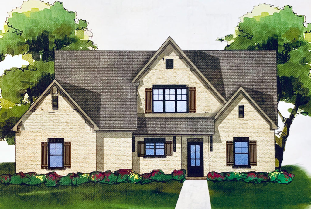
Like I mentioned in the Exterior Design Plan blog post, our model or floorplan has not built anywhere near us. I was surprised how I struggled to design a home from pure concept. I didn’t realize how much my design and inspiration come from actually feeling how a house lives, the history of the house and the existing, inherent style.

Interior Design Vision for the Lake Ridge House
To establish a starting point for the interior style of our new home, I looked to the subtle hints of Tudor architecture on the exterior.

The classic style of a Tudor home will inspire at least some the interior choices. It will become a starting point for what is characteristically the blank slate of a tract home new construction. Whenever possible, the goal should be to create a cohesive home with the exterior and interior in alignment. For example, a timeless Victorian home is steeped in that style both inside and out.

My ultimate goal is to create a welcoming home rooted in traditional design but is also influenced by our Southern heritage. Seeking to create a calm retreat and yet I’m not one to design with solely neutrals at every turn, I will use some contrast and create opportunities for pops of color. You will see hints of this contrast in the basic interior selections.
Considering the Floor Plan

Originally, the floor plan for this house was designed with a fireplace and two French doors on the far wall, similar to the photo above. I opted to forgo the fireplace and add windows instead to let in as much light as possible.
It was also very important to me to feel connected to the view out back.

The lot is on a ridge of a lake with views of the most beautiful sunsets. That is the one perk I look forward to the most with this house!

We are up high enough on the lake that it feels very private even with a row of houses on the other side of the lake. This winter, we will be able to remove some of the smaller trees so more of the lake below can be seen. When we signed the contract in the early spring, before the leaves fully developed, we could easily see the lake.
Interior Paint Colors
Generally, in new construction you are given an allowance for one or two paint colors and a trim color. While I hardly doubt I could be limited to so few colors in our house long-term, I sought to choose a neutral base color that would work best for a majority of the rooms.
To add some interest to the basic shell of the interior, I wanted to use white on the walls and a grey or greige on the trim. I was initially inspired by a few images I found of Tudor homes designed by Joanna Gains.


I have also loved this combo of medium-toned neutrals and whites by Jenna Sue. She has successfully used this combo in her renovations and recent new build.
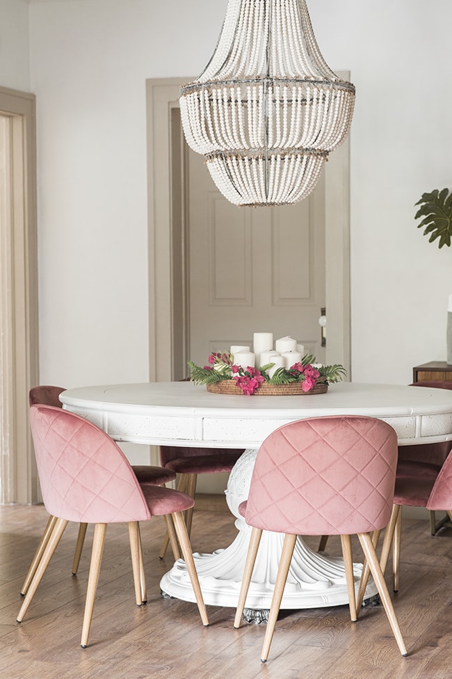
The difference is I am going to use my favorite soft grey, On the Rocks by Sherwin Williams. It is the grey I have used in our master bathroom and master bedroom here at the Trail House.
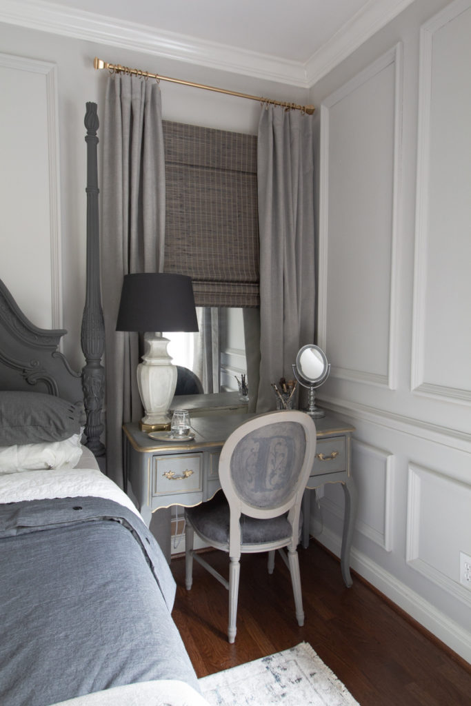
I love it because it feels neither too cool nor too warm, is not too light and the undertones are fairly neutral. Most importantly, it does not shift much in different lighting. This is a very important requirement because I am designing for basically unknown light sources and light intensities.
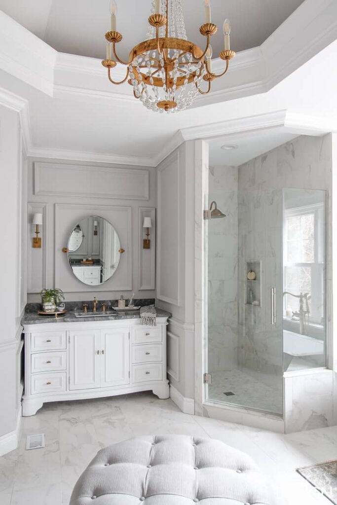
For the walls, I have chosen Pearly White by Sherwin Williams. It might seem easy to settle on “just a white”, but there are so many undertones to consider. It was important to me to find just the right white. I wanted a white without a yellow undertone so that it also didn’t feel like a cream. On the other hand I didn’t want the white to be too cool either.

What I hoped I could find was a white with a little bit of grey, making it the perfect pairing with the On the Rocks. I think Pearly White fits that bill. (If you followed my ramblings on Instagram Stories recently, I shared my thought process with you at length. 🙂 )
Flooring for the Main Living Area
Given my concern for the potential for minimal natural light, I chose a very light hickory flooring for the main living areas of the home.
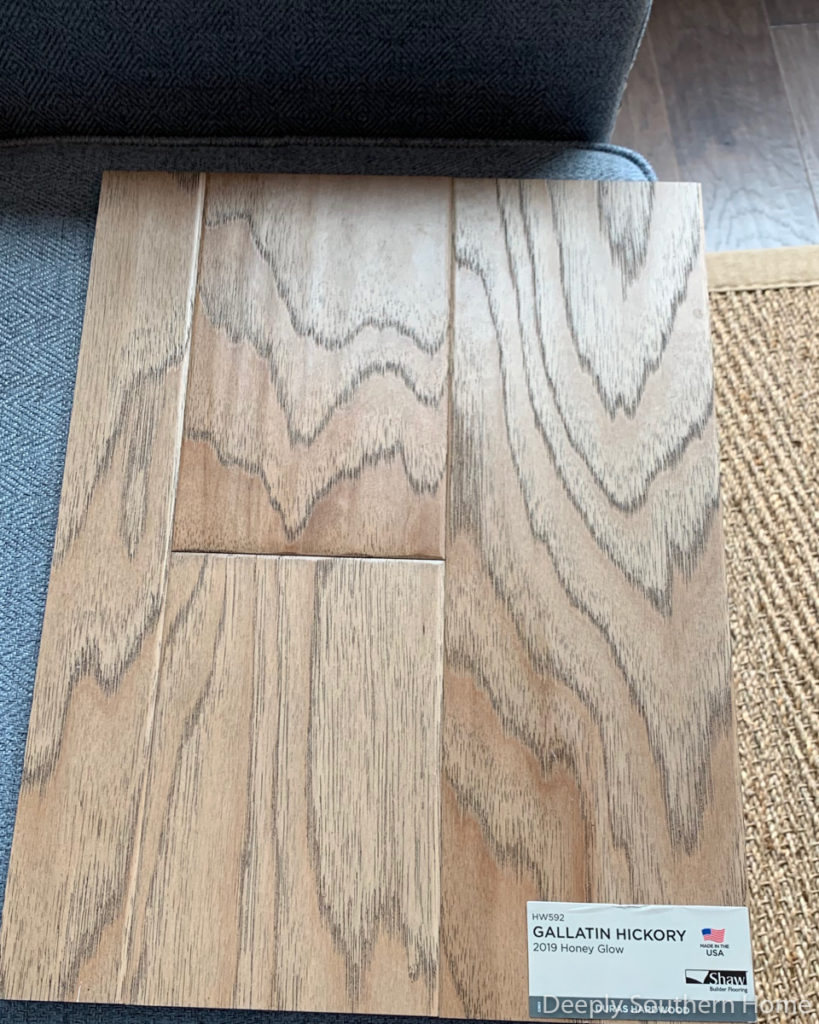
I especially love the soft grey grain of the wood. The color of the finish looks like it will be easy to keep clean-looking too. The floor will continue this theme of a subtle mix of contrast yet, have similar tones of the grey trim. I also just realized Freddie’s hair, should he begin to shed, will blend in nicely with this tone.
This is a photo of the floor installed in one of the other homes.

Open Floor Plan
With those selections in mind, I’ll share a little more about our living room and dining room area. One of the most popular ways to reduce the square footage of a home, especially when considering a downsize like this, is to replace the under-used dining room with a large combination open space. I included this image below because the kitchen in a cased opening similar to ours.
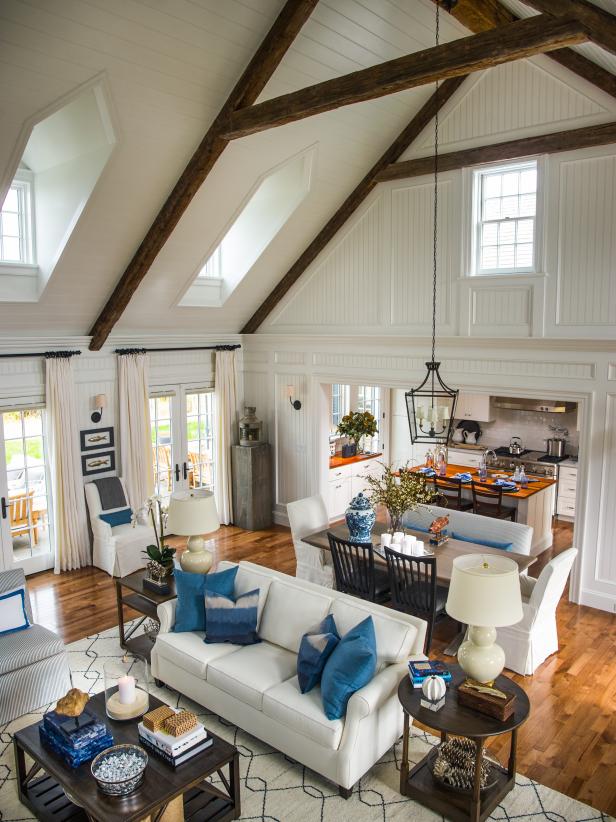
Here is a photo from early on in the framing process. Wouldn’t it be positively dreamy to add those skylights from the inspiration photo too!
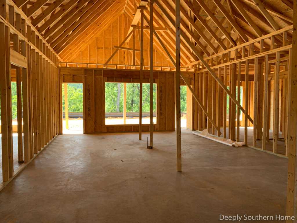
Just as you saw in the inspiration photo, the dining area is immediately in front and the living room is at the end. I was standing in the area that will become the kitchen.
Vaulted Ceiling
To accentuate the vault we had initially added beams to wrap the cathedral. But when I realize this upgrade was not truly beams, just 3 pieces of wood constructed to look like a beam, I changed my mind.
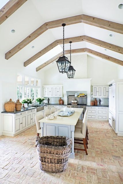
With the freedom to do something different entirely, I decided to fill the space better with beams similar to this. This type of beam needs to look like an actual beam, even if it most likely will be made of faux wood for ease of installation and budget.

I have sourced a few manufactures of faux wood beams and now the only question is how many beams will look the best in our space. I like that in the image below, the beams hint at the division of the spaces.

Adding a Fireplace
With the fireplace removed from the original floor plan, my desire is to add a wall of built-ins and possibly an electric fireplace on the wall to the right.

For inspiration, I did not have to look much further than our current house.
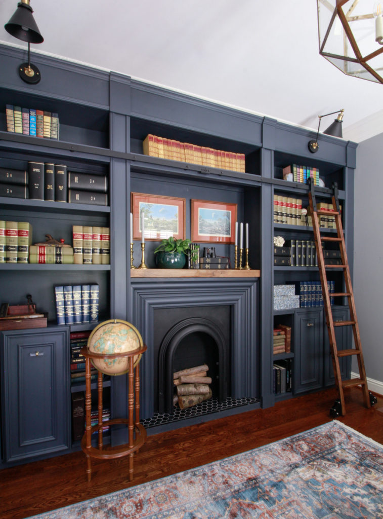
We will need the area over the fireplace to be a little larger to accomodate a TV, but this is a great place to start. You can see more of the library we created for my husband’s office here. Spoiler alert: just like the new house this was a blank, boring wall before.
With the base of this design plan shared, hopefully you can see the outline and the genesis for the design elements and the direction I hope to take our new home.
In order to keep this post from becoming a novel, a follow-up post will include more details about the lighting, kitchen, laundry room and bathroom designs.





2 Comments
Lee Ann Everhart
July 13, 2019 at 12:13 pmThe term to use is collar ties.
From first look at the room and plan, 3 or a max of four should do it.
My two cents.
Leslie
July 13, 2019 at 3:07 pmThank you for that term! I looked it up and now I have a better understanding of what I am trying to mimic for esthetic purposes. I think the location of what I want visual would make it a mid-range rafter tie. I hadn’t gotten to the specifics yet, but I had already told my husband I didn’t want to throw beams up there at random. I wanted them to make sense. Thanks for your two cents!! They were invaluable!!
https://inspectapedia.com/structure/Roof_Framing.php